
Overview
I would like to start the executive summary of this work with a question: “How often do you, my reader, visit your local government website?“ I am sure not that often, because there are always a lot of different information, which usually is not well organized so it makes our experience of using the website very overwhelming. That’s why me and my team got requested by our client Jersey City to redesign the information architecture of their website, find the reasons why locals avoid this valuable source of information about their local government, so we can inspire them to use it frequently and make this experience enjoyable.
The user and the archetype we had in mind was someone who was new to owning a home in Jersey City, New Jersey and was seeking a job. First we set out usability testing of existing website with people who lived in the state, owned a home, and/or were looking for a job, so we can find pain points and fix them. We created a survey with a goal of identifying our target audience so we can collect more useful information, which can help us to make correct changes. Based on that we chose candidates and started our testings. Another activity we did to gain some additional insight was a card sort. This was a great way to see what page groupings made sense to our users and test if our current layout made sense. This was a great activity in terms of starting for the redesign because we can see alternative grouping and labeling for pages that would make more sense of our users.
In addition to our user interaction research, we also conducted business analysis. There specific analysis we did were Business Model Canvas, Competitive Matrix, Competitive and Comparative Feature Analysis, and a Heuristic Evaluation. These analysis we a great way for us to understand our business, our competition and our site.
With all this qualitative information collected we started our design process, which we tested as well and see the difference between existing and new versions to see how effective it was and if our research was helpful.
Client

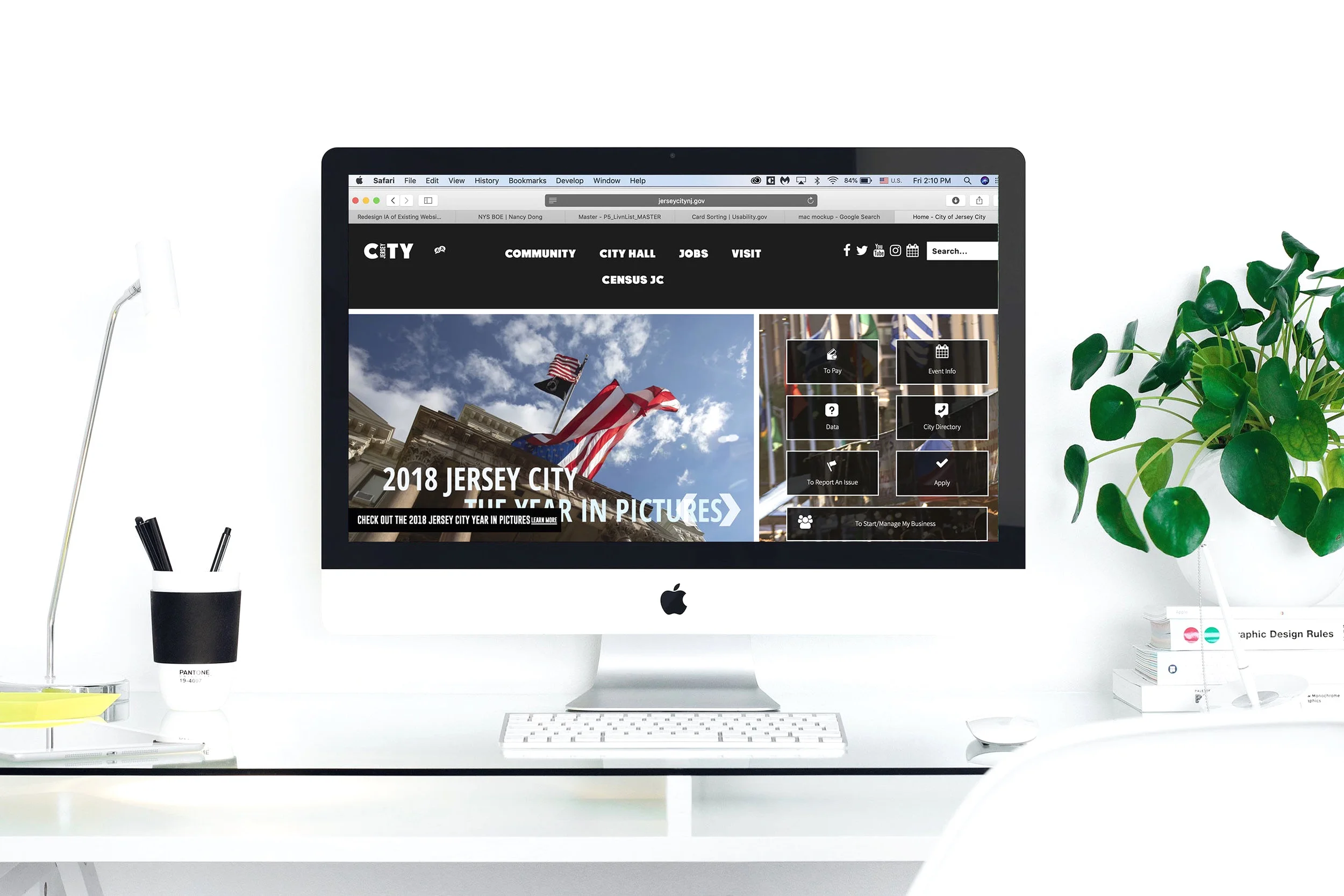
Jersey City is the second-most-populous city in New Jersey state, after Newark. It is one of the most ethnically diverse cities in the world. The city is a major port of entry for immigration to the United States and a major employment center at the approximate core of the New York City metropolitan region; and given its proximity to Manhattan Jersey City has evolved a globally cosmopolitan ambiance of its own, demonstrating a robust and growing demographic and cultural diversity with respect to metrics including nationality, religion, race, and domiciliary partnership.
Jersey City is a regional employment center with over 100,000 private and public sector jobs, which creates a daytime swell in population. Many jobs are in the financial and service sectors, as well as in shipping, logistics, and retail. Jersey City offers reasonably-priced homes, noteworthy parks, restaurants, bars and other attractions that will make you want to become a part of its community.
Research Methods
Screener Survey
Usability Testings of Existing Website
Business Model Canvas
Competitive Matrix
Competitive & Comparative Feature Analyses
Card Sorting
Heuristic Evaluation
Mobile Audit
Sitemap of Existing Website
User Flow of Existing Website
Screener Survey
Me and my team already had an archetype in mind, so before starting the usability testings of existing website we needed to find that specific target audience, which we can ask them to test our product so we could get better understanding what makes the experience not pleasurable.
The Survey guide is attached below:

Key Takeaway
Based on the survey responses, we chose to interview 5 candidates who had some familiarity with a local government website, owns a property or is looking to purchase. We also considered candidates that are currently job searching or have looked for a job recently
Usability Testings of Existing Website
Usability testing was a great way to observe users using the website. This is an important part of the research process because we can watch real users try to complete task. This helps us see what makes sense and what doesn't in practice.
Key Takeaways:

The site was kind of frustrating for our users; it was not intuitive. Even when users were able to complete their task quickly, they were a little confused.
Task was very difficult for most people. Getting to the property taxes page was hard and the average time took over 2 minutes.
After the first task users still struggled to complete task but got faster each time.
There were many indirect ways to complete a task given all the possible avenues and shortcuts.
Problem Statement
Residents have difficulty finding information about their local government, staying up to date with news and events. They also want to work within their city, not spend a lot of time to commute and be a part of their community.

“How might we help residents to find their local government information, make property tax payments, search and apply for current jobs openings and be informed about current local events?”
Business Model Canvas
Creating a business model canvas helped us take time to think about and understand our business. By taking the time to walk through this and see how our organization functions we were able to better identify what an end goal for our site could be. Jersey City works with many partners and offers many things to its constituents. They are creating a place that is a great place to live

Key Takeaway:
Jersey City is a diverse city that works with other local and state government to oversee entities of the local government. It handles community needs and provides important services by means of skilled trade and professional sectors. Communications are channeled through its main website and social media.
Competitive Matrix

The City of Jersey City’s website provides a broad range of information, news and data for its community and others who might be planning to move/ visit the area. The website also links to a number of affiliated websites for further references. This was a great exercise to help visualize how your organization compares to its competition.
Competitive Analysis

My team and I decide to have a look at our competitors, which was a great way to see how they have created their sites.
Creating this side by side analysis clearly helped us define what features that our archetype could use and were we could see positive examples of them.
Card Sorting
Card sorting is a method used to help design or evaluate the information architecture of the website. It actually was super helpful because it helped my team and Myself to understand our users' expectations and topics of the website. We did 10 rounds of card sorting using open (5 rounds) and closed methods (5 rounds). The results helped us to make right decisions how to build the structure for our website, what to put on the homepage and label categories and navigation.

Key Takeaways:
Open Card sorting was very complicated for every user, absolutely everyone said doing this method that is very hard
Doing Open Card sorting users were taking long pauses, putting cards away because they didn’t know how to categorize them, and acted very stressed
Some themes in expected/ideal categories were city hall, resident services, community, jobs/careers, and city development
Closed card sorting revealed that there is only 7 of 44 matches with existing category
Closed card sorting was easier for users than open, because it was labeled but it still was confusing
Heuristic Evaluation
In our heuristic analysis we took time to look through pages like home, taxes, jobs, community and city hall. This was an important exercise so we could see where our site stands in regards to this “UX rule of thumb”.
Some insights we saw were:
The range of scores was from 2 to 4. To us this showed that out site had a lot of room for improvement. The average score of our site was about a 3.
Accessibility has the highest score and our site was Level AA compliance.
The lowest score was in controllable with a 2. A huge factor in this low score was no warning when exiting the site. Many pages and clickable links go to external sites which open in your current tab. At first you think its the same site until you realize there is no way of getting back to the home page. Since the site isn't very clear and people clicked around to accomplish their task, this contributed to a lot of frustration.
Mobile Audit
Even though the Jersey City Website consider as a responsive website and its landing page for mobile seems to be custom and reactive for mobile however many of the other pages have not maintained the right hierarchy of images and content when resized. The functions on the main pages remain in mobile but lacks the prominence when compared to the desktop view. This was a great exercise because it seems like both desktop and mobile are the same site, just responsive. This helped highlight some areas were they should differ in UX and UI and this would be a great place to start some next steps.

Annotated Mid-Fidelity Wireframes
After collecting the research data and stating a problem, which helped me to understand what struggles our users have and how to avoid them and keep it less stressful and more enjoyable, I started my mid-fidelity design chapter based on the research information. The most important was to make design simple and intuitive, but at the same time welcoming the user, so it would make him stay and explore. I changed the the categories of the main menu, because old one was very confusing to the user. To make sure the new labels were right I conducted the closed card sorting.
Design Evolution:


Insights:
Users were confused with the information and navigation of the websites. It had two different shortcut menus, which one was obvious cause it was right in a front and there was “hidden” one on the bottom of the page. That’s why it was important to make website organized and intuitive.
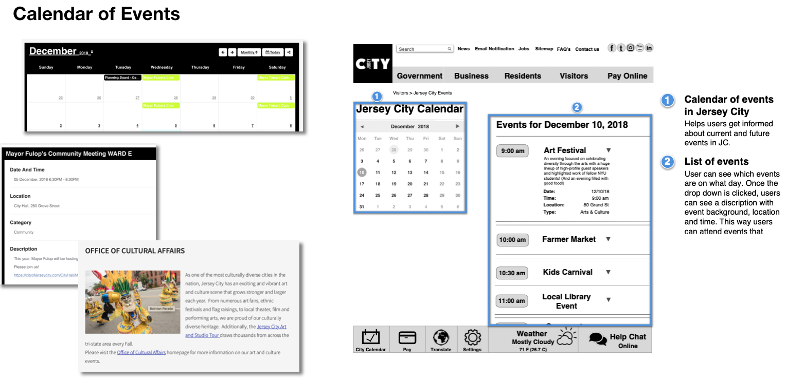
Footer was added with main features such as a city calendar, which helps our users feel like their a part of community and be informed with what’s going on in their city. “Pay” gets directly to online payments, without being distracted by different information.
Now user can see calendar of events, so they can either attend it the same day or plan it in advance without going to different external websites.
Now you can apply for current job openings without filling up the application, just uploading your resume and cover letter. You can do it within the website without opening an extra tab.
I make the property tax information of residents private unless u put any insight to locate your property, so it won’t confuse the user with numbers.
Card Sorting - Revised Website

Insights:
The categories names got more understandable to users, they sorted faster than the previous ones
Testers weren’t hesitated and never put cards on the side. They were strongly confident what they were doing
The matched amount of cards increased by 65%
Sitemap and User Flow of Revised Website


Key Takeaways:
After redesigning Jersey City website, the map site changed as well. It became much more organized and clean. The Categories are changed, there are no more external websites, all information is within the website, there’s no repeats. Each category has its own exclusive content and there are also utility bar menu and footer
Now User can take shorter path to complete their task using the website. There are no longer external websites during the path. There are still several ways to complete the task (main menu or shortcut). They are very intuitive and easy to complete
Usability Testings - II (Revised Website)
Usability testing of new designs helped me to understand how effective designs are, what are the strengths and what are still pain point and need to be working on.
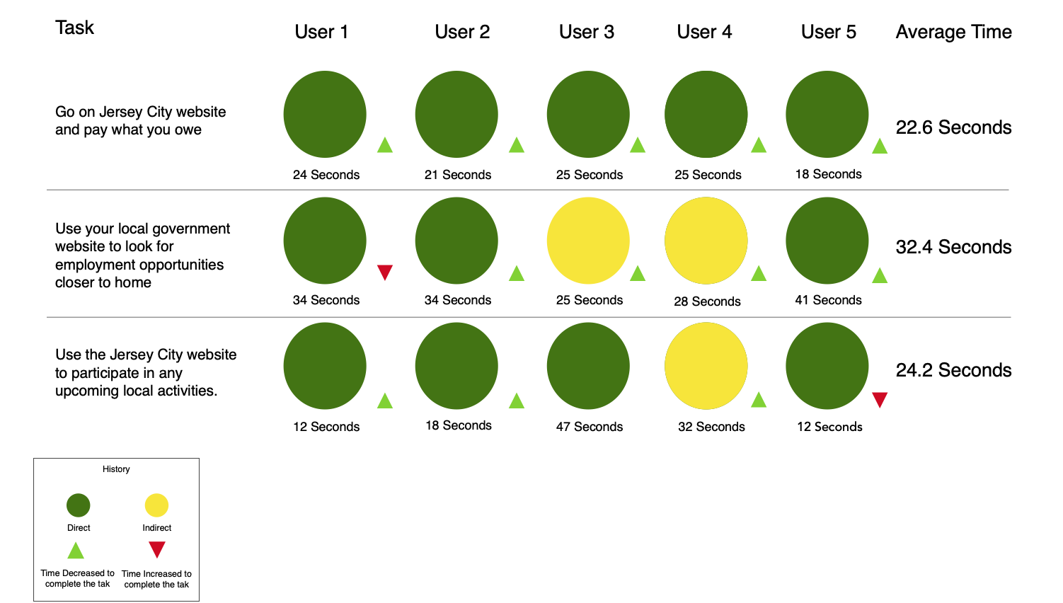
Key Takeaways:
Design was more intuitive to users, and completing the task were faster then with old designs
It was much less confusions with insights of the website. Almost every tester did a direct path to complete the tasks
Users like the footer because, it was the shortcut to see where they can explore activities in Jersey City
The average rate of how useful and easy the website was 2 out of 5. (1 being easy, 5 being difficult)
The timing of completing the tasks decreased to less than 1 minute per task
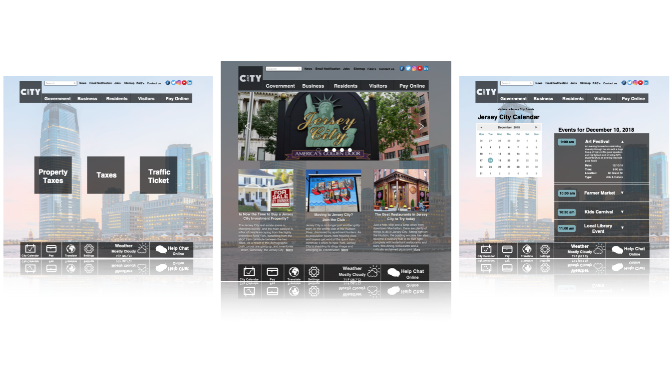
Final Prototype
Click here to view InVision Prototype https://invis.io/7QQ7SGPHJWD
Next Steps:
Conduct another round of usability testing and iterate the designs
Build out the “My Jersey City” experience
Expand scope of project by looking into other essential flows like parking and events.
Add something for residents who are new to JC